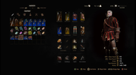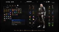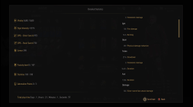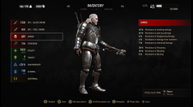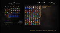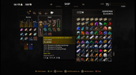
A look at The Witcher 3's menu overhaul
The Witcher 3 is almost over with the upcoming release of its final expansion for the game, Blood & Wine, but CD Projekt is still making iterative improvements to the game even as it nears its final new content drop.
A major addition launching alongside the Blood & Wine expansion pack is the arrival of new menus for the game, offering up new designs that the company hope will offer both improved functionality and a significant bump in how visually pleasing the menus are to look at - after all, in a game like this, you spend quite a lot of time looking at them.
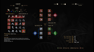
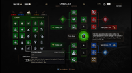
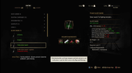
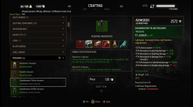
We've seen and used the new menus in action as part of our three hour hands-on with Blood & Wine, but CD Projekt has also kindly furnished screenshots to show several major menus before-and-after. See for yourself the differences in the Character, Crafting, Inventory, Shop and Statistics menu below in both video and screenshot form, and don't forget you can find our full preview of Blood & Wine through this link. In the screenshot gallery, the old version of each menu is immediately followed by its new version.
