Chrono Trigger on Steam gets updated with a new battle UI
As we mentioned last month, Square Enix quickly realized just how much of a mess Chrono Trigger was when it made it over to Steam. This prompted them to add back in the original spritework as a toggle along with a few other changes. Today, the game experiences yet another important update with Patch #2.
Here is a rundown of all the changes that have been made according to the Steam community post:
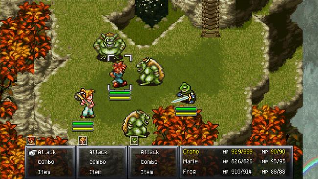
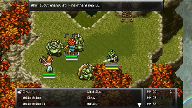
- A new battle user interface (UI) has been added based on the look and feel of the original CHRONO TRIGGER.
- An option has been added to select between the UI optimised for controller/keyboard mentioned above, and the current UI optimised for mouse & touch panels. This option appears in “settings” in the main menu.
- The game can now be paused during battle by using the pause button on controller, or the Space bar on the keyboard.
- Adjusted the look of playable characters on the world map to be more in-line with the original version of CHRONO TRIGGER.
- The resolution of animated cut-scenes has been improved.
- The display area of animated cut-scenes has been increased.
- Fixed instances where the game slowed down during certain scenes.
- The Korean font has been updated.
- Other small bugs are fixed.
You can take a look at the new user interface for combat in the shot below:


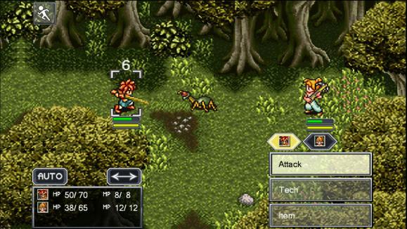
Looking a bit closer to the original SNES style. To give you an idea of how important an adjustment this is, here is what it looked like before:

Also noted in the post is that developer plans on releasing yet another update sometime next month in June as they continue to make tweaks to the user interface outside of combat (hopefully that includes the giant Map button on the overworld).